Font Sizes
All blocks with Typography settings have the same selection of font sizes available. Font sizes are fluid and automatically adapt to the screen width they are viewed on. We use CSS clamp in the theme.json theme files to archive fluid fonts.
You can choose the following sizes:
value   desktop   mobile

3xs     12        12
2xs     14        14
xs      16        16
s       18        18
m       20        18
l       24        20
xl      30        24
2xl     36        30
3xl     48        36
4xl     60        36
5xl     72        36
6xl     96        48
7xl     128       60
8xl     192       72
9xl     296       96
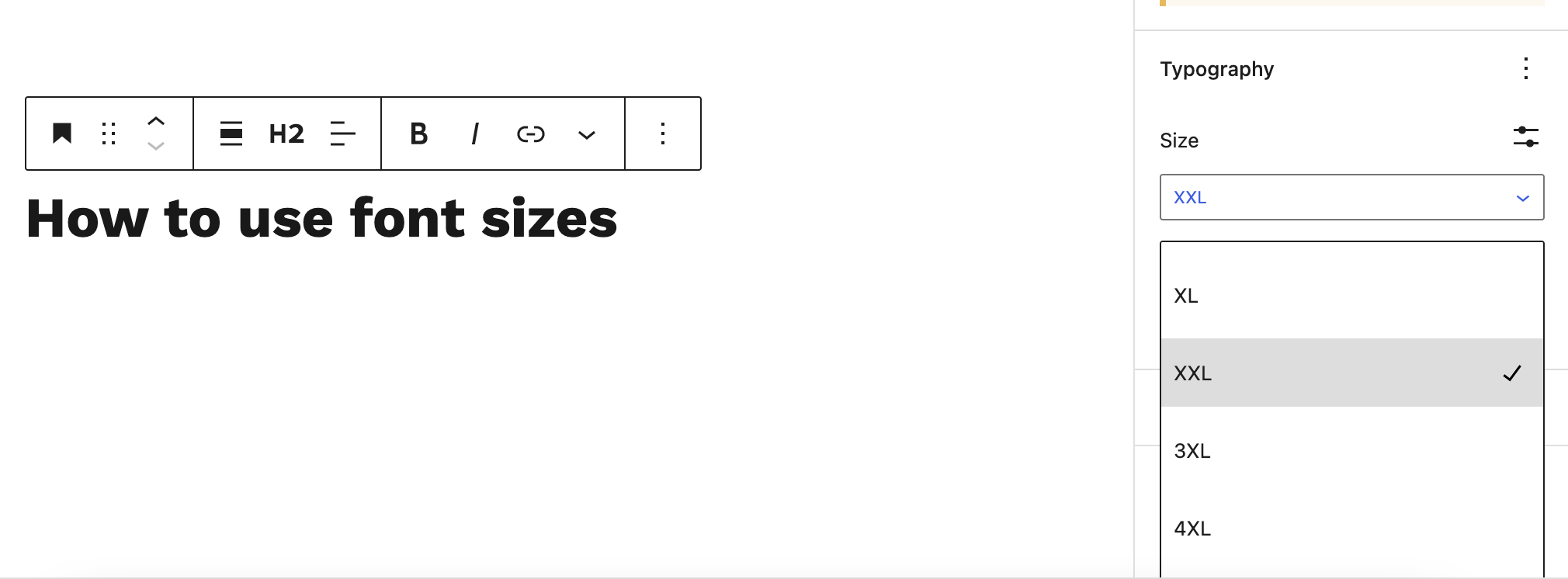
How to set a font size
After adding your block in the editor open the Settings panel and scroll to the Typography settings. Choose one of the font sizes from the drop down menu.
Using custom font sizes
Additionally, to the font sizes that come with our system, it is also possible to use a custom font sizes. Please note that custom font sizes are not responsive, but instead use a fixed pixel or rem value. To keep the consistency of the design, a custom set font size should only be used if no other font sizes works.
Reset font sizes
To reset the font size to the default value, click on View Options (the icon with the three small vertical dots) in the Typography settings. This opens additional Typography settings, including the Reset option.