SolarOne Theme
- Required plugins: AinoBlocks
- Recommended plugin: AinoBlocks Patterns
Getting Started
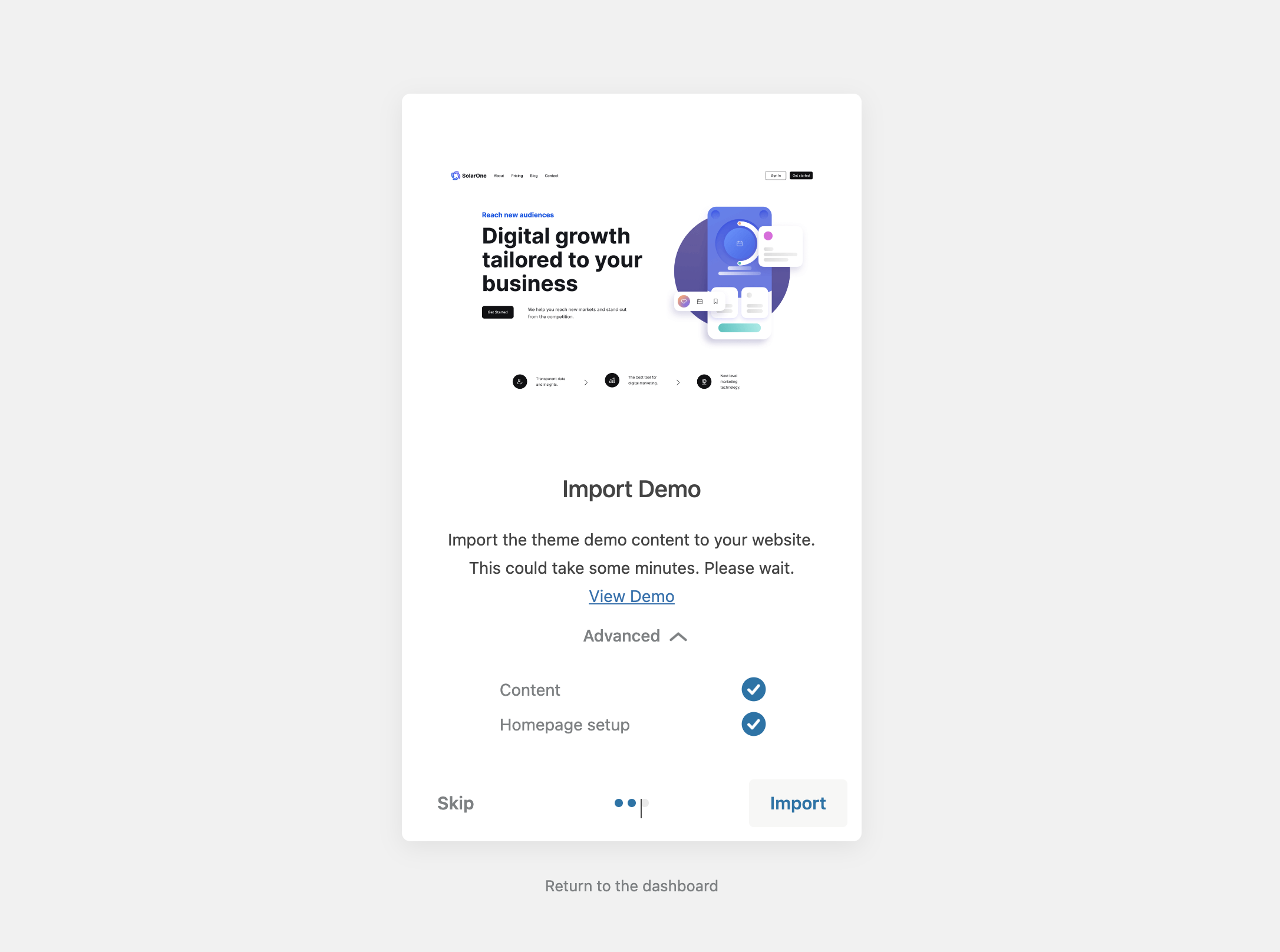
After the theme and required plugin installations, you can import the demo data via Appearance > Theme Setup.
Here, you will be guided step by step through the demo import process by our theme setup wizard.
Edit the Header
As the Header and Footer will be a consistent part of most of your pages, I recommend setting up the Header and Footer of your website first before adding content to your pages.
You can edit Template Parts like the Header and Footer via the Site Editor.
- Go to Appearance > Editor in your dashboard.
- Now click on Template Parts.
- Look for Header and click on the Edit icon (the icon with a pen) to open the Header Template part and to see the theme’s default Header in the Editor view.
Editor tips:
To get a better overview of the blocks and nested blocks in use, I recommend having the List View open when working in the Editor.
For small Template parts like the Header, it can also be helpful to activate the Top Toolbar view.
Site Title and Site Logo
You can use the Site Title and Site Logo block to add your website title and logo to the Header.
The position of the Site Title and Logo in the SolarOne default Header is left aligned. To be able to use the Site Title and Site Logo in combination, they are both wrapped inside the AinoBlocks Flexbox block.
It’s possible to change the font size of your site title inside the Site Title block settings. You can also change the text color.
To replace the demo’s site logo with your own image, click on the logo in the Editor and then click Replace in the Toolbar.
The Site Logo can be set as your website favicon in the Site Logo block settings.
Navigation
To fill the Navigation block with your menu items, you need to click on the Navigation placeholder so that the + ‘Add Block’ symbol occurs.
Now you can click on the little + button to add links to your menu items with the help of the pop-up window.
In the Menu item block pop-up window you have the option to search for a post, page, create a new one or set a custom link.
As a second option, you can open the Block settings panel via the Settings icon on the top right of the editor and choose a previously created Navigation from the select panel under Menu.
Mobile Navigation Menu
The Navigation block automatically converts to a mobile menu. If you have set up your Header navigation by expanding the menu used in the sample content, you are all set to go, and no additional setting adjustments are needed.
In case you used a new Navigation block, you can check the following Navigation block settings under Settings > Display.
Here you can choose to either use the Icon buttons to open and close the mobile menu or to use text instead.
You can also choose between a two stripes or three stripes hamburger menu.
The Overlay Menu setting gives you the option to decide if you don’t want to show your mobile menu, only show it on small screens or always show it, even on desktop screens.
Call to Action Buttons
The default SolarOne theme Header adds two Call to Action buttons using the AinoBlocks Buttons block on the right side of the header.
These two buttons will only be visible on desktop screens. To offer the same links in your mobile menu, you can add Menu items to your main menu and hide them on desktop screens.
Useful helper CSS classes
To hide elements on different screen sizes, you can use the Ainoblocks helper CSS classes.
In order to show a menu item in the mobile menu but hide it on tablets and desktop screens, add the two CSS classes mobile-hide tablet-show to the menu item under Settings > Advanced > Additional CSS Class(es).
mobile-hide tablet-showEdit the Footer
You can edit the Footer Template Part via the Site Editor.
- Go to Appearance > Editor in your dashboard.
- Click on Template Parts and select Footer.
- Click on the Edit icon to open the Footer Template part in the Editor.
The default SolarOne Footer has two main Group blocks. The first one contains the newsletter block.
Read more on how to add a newsletter to your website.
If you don’t want to a show a newsletter sign up form in your Footer, delete the entire first Group block.
The second Group block contains of a four column grid, with the first grid column showing the site title and logo and the other three grid columns containing footer menus.
Below the four columns, you can add your Copyright text and additional important sitewide text links to your privacy policy or imprint. Right aligned at the bottom of the footer is the option to link to your social sites using the Social Icons block.
Page Templates
Homepage
About Page
Pricing Page
Contact Page
Blog
Patterns
To extend your website with additional patterns that are not shipped with the theme, you can install our free AinoBlocks Patterns plugin with an ever-growing pattern library.